Patient app UX & UI

Healfie

Digital product

Healthcare

Context

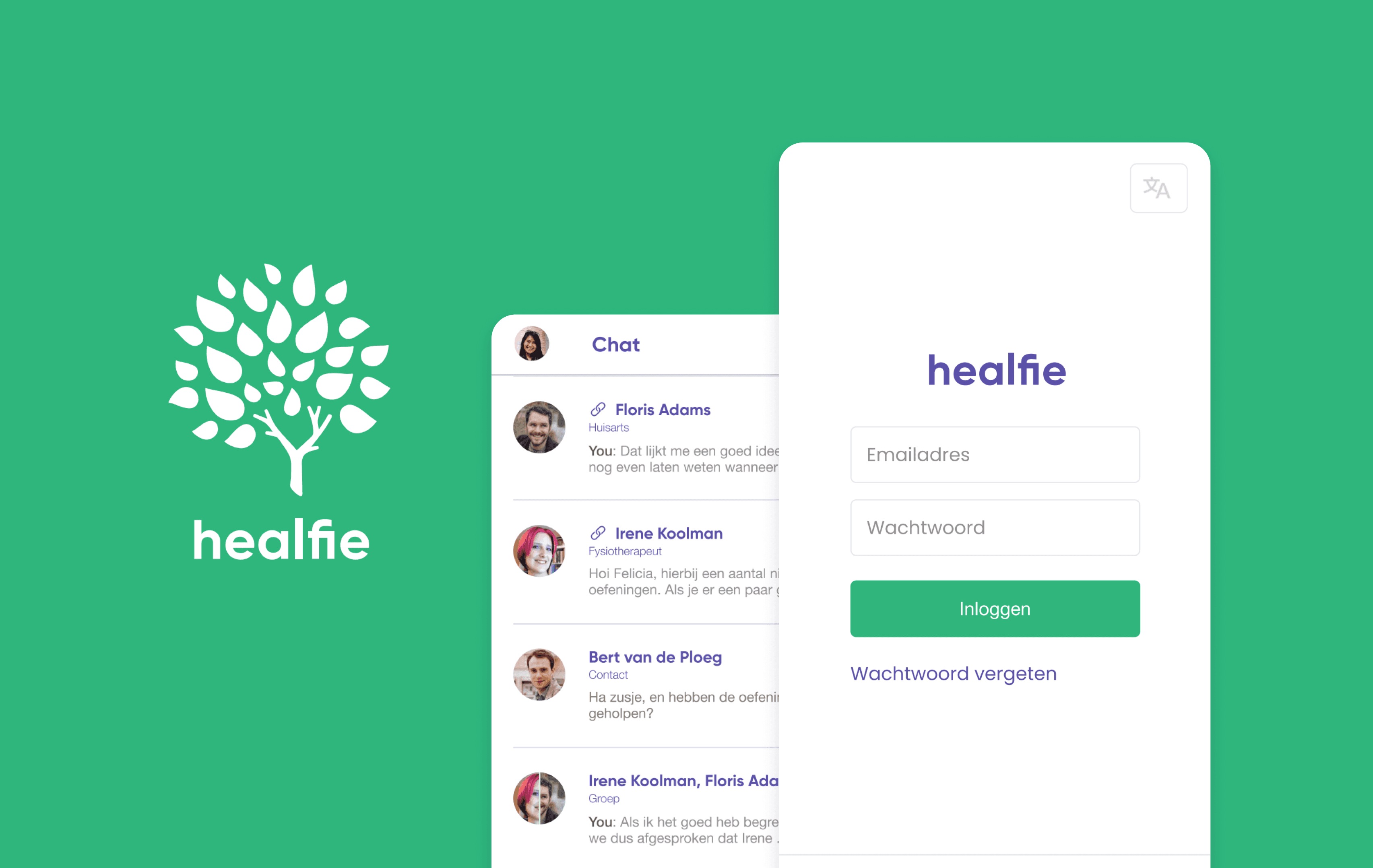
Healfie was a Dutch health-tech startup connecting patients with their care providers — GPs, physiotherapists, coaches — in one mobile app for messaging, record-keeping, and appointments.

Context

Healfie was a Dutch health-tech startup connecting patients with their care providers — GPs, physiotherapists, coaches — in one mobile app for messaging, record-keeping, and appointments.

Challenge

Functional but was fragmented and lacked clean UI. Onboarding was nonexistent, the dossier lacked structure and privacy clarity, and the visual language was inconsistent — undermining trust in a healthcare context.

Challenge

Functional but was fragmented and lacked clean UI. Onboarding was nonexistent, the dossier lacked structure and privacy clarity, and the visual language was inconsistent — undermining trust in a healthcare context.

Solution & Impact

Delivered a cohesive UX and UI overhaul across the patient-facing mobile app, covering onboarding, the medical dossier, chat, provider profiles, and the contact system — establishing a unified visual language and improving clarity and trust across all key flows.

Role

UX/UI designer

Duration

2 months

Company

Healfie

Skills

UX

UI

Tools

Figma

"How might we make a complex, multi-provider health platform feel approachable and trustworthy for patients?"

Onboarding gaps

New users landed in the app with no understanding of what Healfie offered or how to get started. There was no flow guiding them through account setup or orienting them to core features.

Messy dossier

The medical record view lacked structure. There was no clear visual hierarchy between entry types, no indication of who had authored what, and no privacy controls visible to the patient.

Connection system confusion

The flow for connecting with care providers or contacts was technically functional but lacked explanation — users had no context before being shown a QR code.

Process

1

Audit & orientation

I began by reviewing the existing screens to map out what was in place and where the experience broke down. This meant tracing the full patient journey — from first launch through registration, connecting with a provider, starting a conversation, and logging something in the dossier — and identifying where users would drop off or feel lost.

Key friction points surfaced quickly:

  • The app launched directly into functional screens with no onboarding

  • The dossier was a blank slate with no guidance

  • The contact flow jumped straight to a QR code with no explanation of what contacts were or what access they'd have.

1

Audit & orientation

I began by reviewing the existing screens to map out what was in place and where the experience broke down. This meant tracing the full patient journey — from first launch through registration, connecting with a provider, starting a conversation, and logging something in the dossier — and identifying where users would drop off or feel lost.

Key friction points surfaced quickly:

  • The app launched directly into functional screens with no onboarding

  • The dossier was a blank slate with no guidance

  • The contact flow jumped straight to a QR code with no explanation of what contacts were or what access they'd have.

2

Flow mapping & prioritization

Working through the key flows, I prioritized the areas with the highest impact on patient trust and activation: getting started (onboarding), understanding the dossier (the app's core value), and connecting with providers and contacts (the collaborative premise). Each of these needed both UX restructuring and visual refinement.

3

UX & UI design

I designed across four main areas simultaneously, ensuring consistency in components and visual language throughout.

3

UX & UI design

I designed across four main areas simultaneously, ensuring consistency in components and visual language throughout.

Solutions

Onboarding that earns trust

Designed a five-screen onboarding carousel that activates immediately after account creation, walking users through the platform's core features before they encounter any of them in context. Each screen pairs a clear headline with supporting copy and a consistent illustration style. A pagination indicator and directional navigation give users control over the pace. The final screen ends with a "Start" CTA rather than a next arrow, signaling completion and transition.

Mockups comparing the before and afters of the onboarding screens.

A dossier built for collaboration

Redesigned the medical dossier as a chronological timeline of typed entries — notes, medications, appointments, chat logs, lab results — each with a distinct icon, entry type label, date, and an author avatar. A privacy toggle on note entries lets patients mark items as private. The empty state uses the brand illustration with a plain-language prompt pointing to the "+" action, so a blank dossier feels like an invitation rather than a dead end.
A contact system that explains itself

Redesigned the "Contact maken" flow to lead with context before action. Rather than opening directly on a QR code, the screen now opens with an illustration, an explanation of what contacts are and cannot access, and two clear action buttons — Share link and QR code.

A unified visual language

Established a consistent UI across the app: purple for navigation and interactive elements, green for primary CTAs and active states, rounded card components for all dossier entries, and the brand tree illustration used deliberately for empty states and onboarding moments.

Were the challenges met?

Onboarding gaps

New users now receive a structured, illustrated introduction to the platform's key features immediately after registration.

Messy dossier

The redesigned dossier makes entry types, authorship, and privacy immediately legible — turning the record from a blank page into a collaborative and trustworthy tool.

Connection system confusion

The contact flow now leads with explanation and offers users a choice of connection method, with explicit reassurance about what contacts can and cannot access.

Reflections

My role: Was brought in to improve the UX and UI of the patient-facing mobile app, working across the full flow from onboarding through the core features.

What went well

Continued learning: This was my first digital UX assignment and first time working in Figma. Looking back, there is a lot I would improve in the outputs, but definitely feel I made some positive changes to the platform.

Collaboration and leadership: During the process, I had a number of meetings with the business leads where user flows would be reviewed together, and I would sketch out ideas for us to discuss as a team — it really felt like a collaborative exchange.

What could be better

Accessibily: Looking back on the designs there are a lot of glaring accessibility issues, especially color contrast. At the time, I was not yet familiar with accessibility standards.

User testing: With more time, I would have advocated for user testing with actual patients — particularly around the dossier privacy controls and the contact flow, where assumptions about mental models carry real risk in a healthcare setting.

What could be better

Accessibily: Looking back on the designs there are a lot of glaring accessibility issues, especially color contrast. At the time, I was not yet familiar with accessibility standards.

User testing: With more time, I would have advocated for user testing with actual patients — particularly around the dossier privacy controls and the contact flow, where assumptions about mental models carry real risk in a healthcare setting.