Dashboard design

Circularity Gap Report > Dashboard

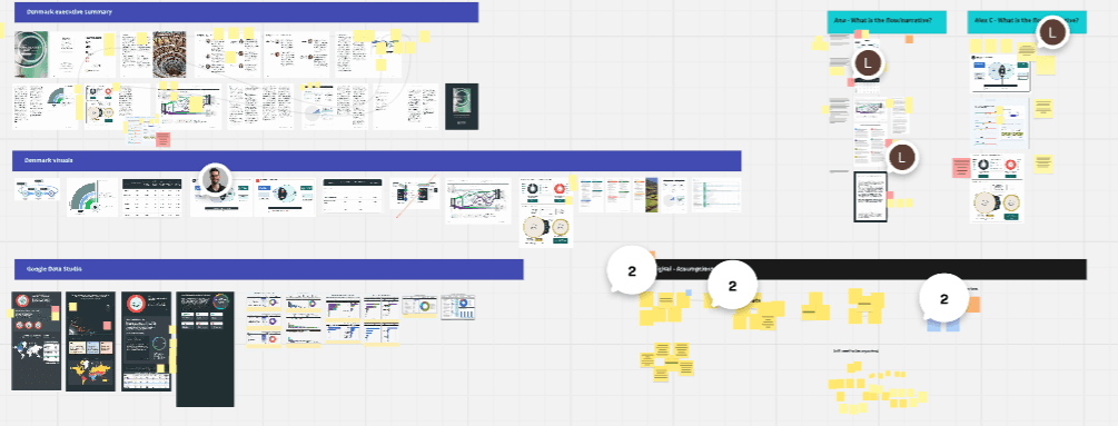
digital, accessibility, systems

Renderings of the CGR Dashboard landing page and the Norway dashboard as product examples.

Context

Transform a dense, academic PDF report into a digital, interactive dashboard in just 6 weeks without causing cognitive overload or blowing past engineering constraints.

Context

Transform a dense, academic PDF report into a digital, interactive dashboard in just 6 weeks without causing cognitive overload or blowing past engineering constraints.

Challenge

Conducted an aggressive scope negotiation to deliver a desktop-first MVP. Designed a chapter-based layout utilizing interactive data cards and cross-filtered chart visualizations.

Challenge

Conducted an aggressive scope negotiation to deliver a desktop-first MVP. Designed a chapter-based layout utilizing interactive data cards and cross-filtered chart visualizations.

Solution & Impact

Lowered production timelines and publication costs via a reusable Strapi CMS template, unlocked the organization's first-ever reader behavioral analytics, and transformed static data into actionable insights.

Role

Lead product designer

Duration

2 months, 2025

Company

Circle Economy Foundation

Team members

Sophia Chou (product designer)

James Yan Aung (product manager)

Isfaaq Goomany (dev lead)

Wazeer Chadun (full stack developer)

Mahima Ramgolam (front end developer)

Skills

User research

UX/UI

Product management

Accessibility

Design system

Tools

Figma

Miro

"How might we transform a dense, text-heavy academic publication into a streamlined digital product that drives engagement, allows us to monitor usage, and reduces our resource input?"

Overambitious scope

Leadership expected an interactive global map and dashboards for dozens of countries in 6 weeks—an unrealistic timeline for a small team.

Cognitive overload

Heavy academic research text risked exhausting users with infinite "walls of text" if translated directly to digital screens.

Hidden insights

Static charts in the PDF lacked user explorability and data deep-dives, while the internal team had zero analytics on reader behavior.

Process

1

Audit & scope negotiation

Content inventory: Conducted a rigorous audit of the PDF report with scientific researchers, red-lining elements that didn't fit a digital context and restructuring the information architecture for flexible navigation.

Strategic scoping: Collaborated with the new PM to present a realistic proposal to senior management, aggressively scoping down the massive global vision to a tightly defined MVP dashboard that could be shipped on time.

A miro board with various elements representing the old report with comments on how they shoud be carried forward in the dashboard.

2

Blueprint & MVP launch

Digestible pacing: Designed structural wireframes utilizing an "At a Glance" landing page and breaking deep narrative text into separate, distinct chapter tabs.

Simple interactions: Kept complex visualizations static for the initial launch but surrounded them with "Data Cards"—high-level metric summaries that compared local data to global baselines.

Figa documentation of the final dashboard design.

3

Scaling interactivity

Advanced interactions: Performed a comprehensive inventory, UX reviews, and QA of standard and custom charts to establish interaction behavior rules (cross-filtering, sorting, drill-downs) for data scientists coding in Vega-Altair.

Contextual learning: Introducing hoverable definitions and links to provide more context, and connected content to real-life case studies.

A screenshot of Vega-Altair's data visualization library.

Solution

Dashboard overview

"At-a-glance": Designed a dedicated overview landing page acting as a macro-summary of the report's major data points, keeping casual readers engaged.

Fast navigation: Created an intuitive starting point that allows power users to jump directly to specific sub-sections or chapters of interest.

A rendering of the Norway CGR Dashboard

Structured navigation

Cognitive rest: Broke the endless scroll into clean, digestible chapters interspersed with relevant visuals, charts, and regional case studies to prevent user fatigue.

Flexible exploration: Allowed professional researchers to pivot seamlessly through the dense report structure without losing their place.

A closeup of the navigation bar, showcasing the "chapters" of the dashboard.

Cross-filtered interaction

Coordinated charts: Coordinated syntax rules for the data science team so that clicking a specific sector automatically updates all adjacent charts.

Data deep-dives: Empowered users to explore complex data relationships instantly without losing the core narrative context.

An overview of interactive data visualizations that were included on the dashboard.

Learning by example

Dynamic real-life examples: Engineered an in-platform integration framework that bridges quantitative data with real-world circular solutions by dynamically pulling local case studies based on the region being explored (e.g., Norway's waste management).

A closeup of the section of the dashboard containing Knowledge Hub case studies.

Were the challenges met?

Overambitious scope

Cognitive overload

Hidden insights

Reflections

Owned the end-to-end design lifecycle for the MVP before onboarding a junior designer for the next iteration. Led data/visual audits, drove scope-negotiation with the PM, created the UI system, and defined interaction behaviors for the data engineering team.

What went well

  • Data-driven pragmatism: Dropped mobile responsiveness and tooltips for launch after analytics showed 80% of traffic came from desktop research users. This allowed us to perfect the core experience within 6 weeks.

What could be better

  • Strategic oversight: Navigating the initial bloated scope required heavy upward management, confirming the importance of getting engineering and design into the room before timelines are locked by leadership.

  • Lack of research: Due to the severe time constraints our analytical assumptions were grounded in historical web traffic and consumer research, but compromised our ability to do qualitative usability testing.